

이번 챕터에서 사용하는 라이브러리는 ggplot2
> install.packages("ggplot2")
> library(ggplot2)
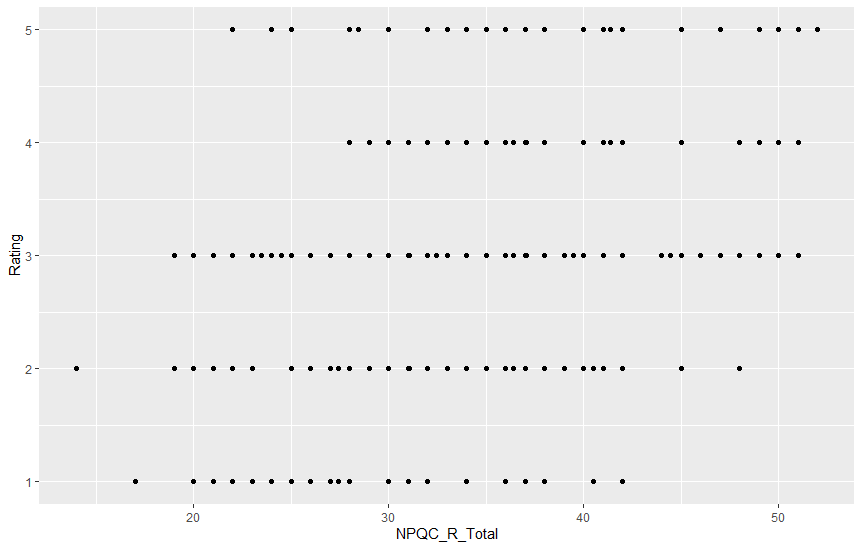
> graph <- ggplot(facebookData, aes(NPQC_R_Total, Rating)) # aes(a, b) = a : x축, b : y축 지정
> graph + geom_point()
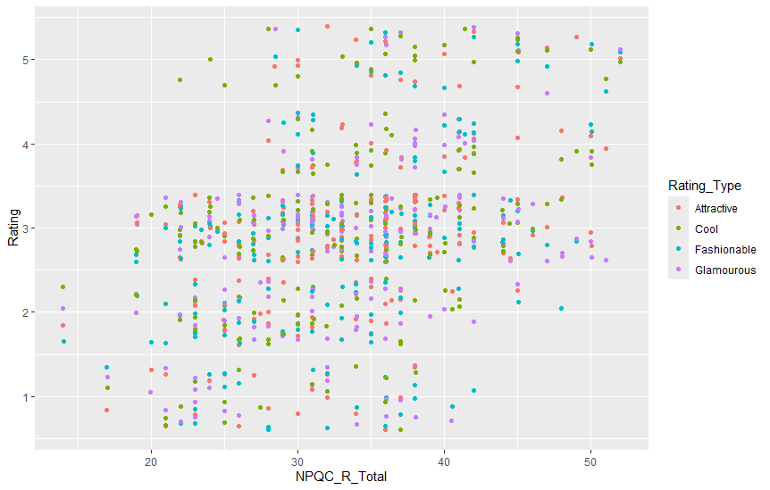
> graph + geom_point(aes(colour = Rating_Type), position = 'jitter') # jitter : 점들에 무작위 값을 추가해서 위치를 조정
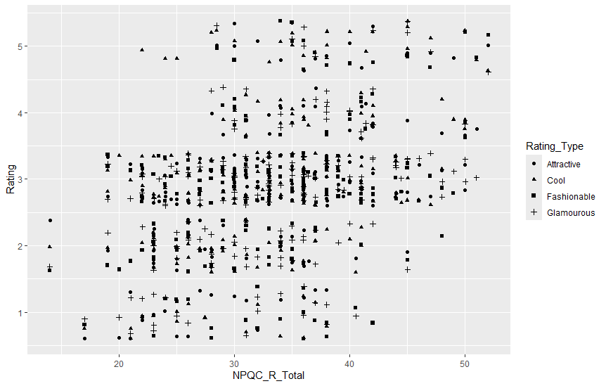
> graph + geom_point(aes(shape = Rating_Type), position = 'jitter') # shape -> 모양으로 구분
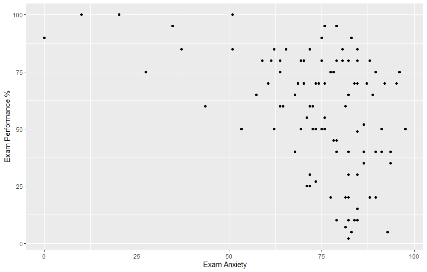
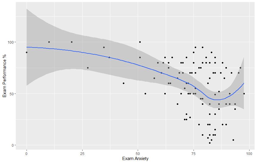
> scatter <- ggplot(examData, aes(Anxiety, Exam)) # Anxiety : 시험 불안, Exam : 시험 점수를 퍼센트로 환산한 값
> scatter + geom_point() + labs(x = "Exam Anxiety", y = "Exam Performance %") # labs : 그래프 축 이름표 추가
> scatter + geom_point() + geom_smooth() + labs(x = "Exam Anxiety", y = "Exam Performance %") # 회귀선[곡선]을 추가
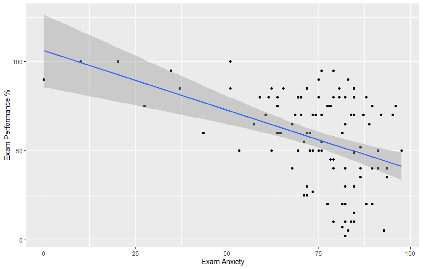
> scatter + geom_point(method="lm") + geom_smooth() + labs(x = "Exam Anxiety", y = "Exam Performance %") # 회귀선[직선]을 추가
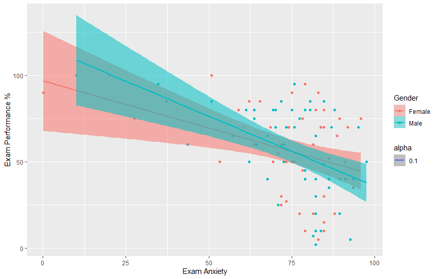
> scatter + geom_point() + geom_smooth(method='lm', aes(fill=Gender, alpha=0.1)) + labs(x='Exam Anxiety', y='Exam Performance %', colour = 'Gender')
# aes(fill=Gender, alpha=0.1) : 신뢰구간을 Gender에 따라 색 지정하기
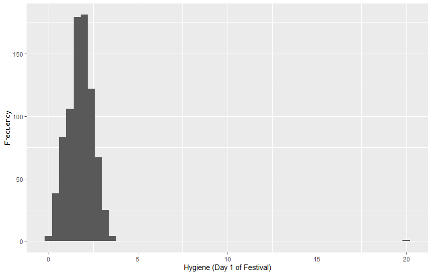
> festivalData <- read.delim("data/DownloadFestival.dat", header=TRUE)
> festivalHistogram <- ggplot(festivalData, aes(day1)) + theme(legend.position = "none") # legend.position : 범례 표시
> festivalHistogram + geom_histogram(binwidth = 0.4) + labs(x = "Hygiene (Day 1 of Festival)", y = "Frequency") # binwidth : 너비
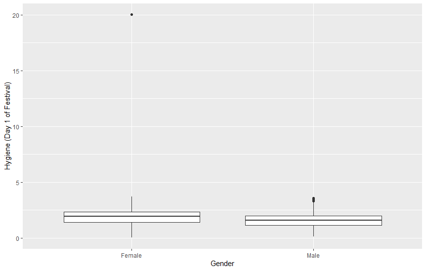
> festivalBoxplot <- ggplot(festivalData, aes(gender, day1))
> festivalBoxplot + geom_boxplot() + labs(x = "Gender", y="Hygiene (Day 1 of Festival)") # 이상치 값 존재
> festivalData <- festivalData[order(festivalData$day1), ] # 정렬 후 이상치 값 확인 [ 여기서는 마지막 값인 20.02 ]
> festivalData[festivalData$day1 == 20.02, "day1"] <- 2.02 # 이상치 값을 정상 데이터 값으로 변경
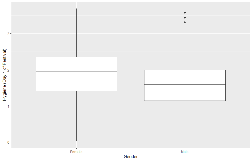
> festivalBoxplot <- ggplot(festivalData, aes(gender, day1))
> festivalBoxplot + geom_boxplot() + labs(x = "Gender", y="Hygiene (Day 1 of Festival)")
> density <- ggplot(festivalData, aes(day1))
> density + geom_density() + labs(x = "Hygiene (Day 1 Festival)", y="Density Estimate")
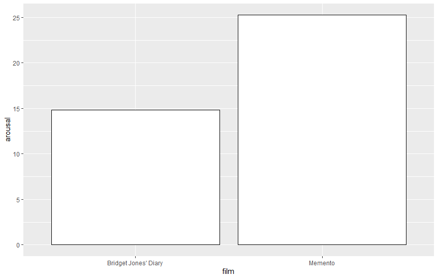
> chickFlick <- read.delim("data/ChickFlick.dat", header=TRUE) # film : 관람한 영화 제목, arousal : 각성 점수
> bar <- ggplot(chickFlick, aes(film, arousal))
> bar + stat_summary(fun.y = mean, geom = "bar", fill = "white", colour = "Black") # fun.y = mean : 평균 계산, fill : 막대 내부 색, colour : 막대의 테두리
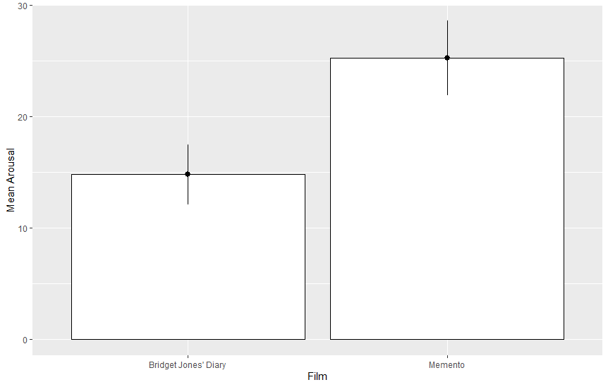
> bar + stat_summary(fun.y = mean, geom = "bar", fill = "white", colour = "Black") + stat_summary(fun.data = mean_cl_normal, geom = "pointrange") + labs(x = "Film", y = "Mean Arousal") # fun.data = mean_cl_normal : 정규분포를 가정하지 않은 95% 신뢰구간
> bar <- ggplot(chickFlick, aes(film, arousal, fill=gender))
> bar + stat_summary(fun.y = mean, geom="bar", position='dodge')
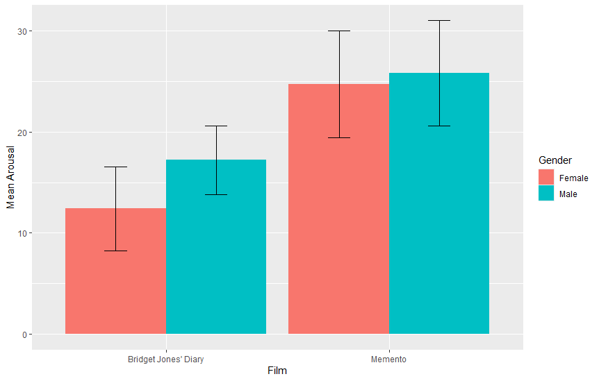
> bar + stat_summary(fun.y = mean, geom="bar", position='dodge') + stat_summary(fun.data = mean_cl_normal, geom = 'errorbar', position=position_dodge(width=0.90), width=0.2) + labs(x='Film', y="Mean Arousal", fill = "Gender") # position='dodge' : 겹치지 않고 나란히 배치
> bar <- ggplot(chickFlick, aes(film, arousal, fill = film))
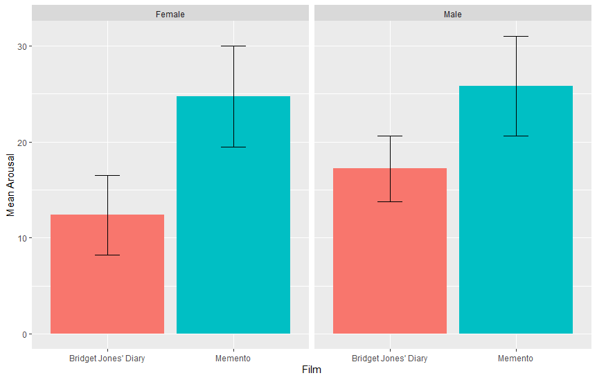
> bar + stat_summary(fun.y = mean, geom = 'bar') + stat_summary(fun.data = mean_cl_normal, geom = 'errorbar', width=0.2) + facet_wrap( ~ gender) + labs(x = "Film", y = "Mean Arousal") + theme(legend.position = "none") # facet_wrap : 분할
> hiccupsData <- read.delim("data/Hiccups.dat", header=TRUE)
> hiccups <- stack(hiccupsData) # 자료의 구조를 긴 형식으로 변경
> names(hiccups) <- c('Hiccups', 'Intervention') # 컬럼 생성
> hiccups$Intervention_Factor <- factor(hiccups$Intervention, levels(hiccups$Intervention))
> line <- ggplot(hiccups, aes(Intervention_Factor, Hiccups))
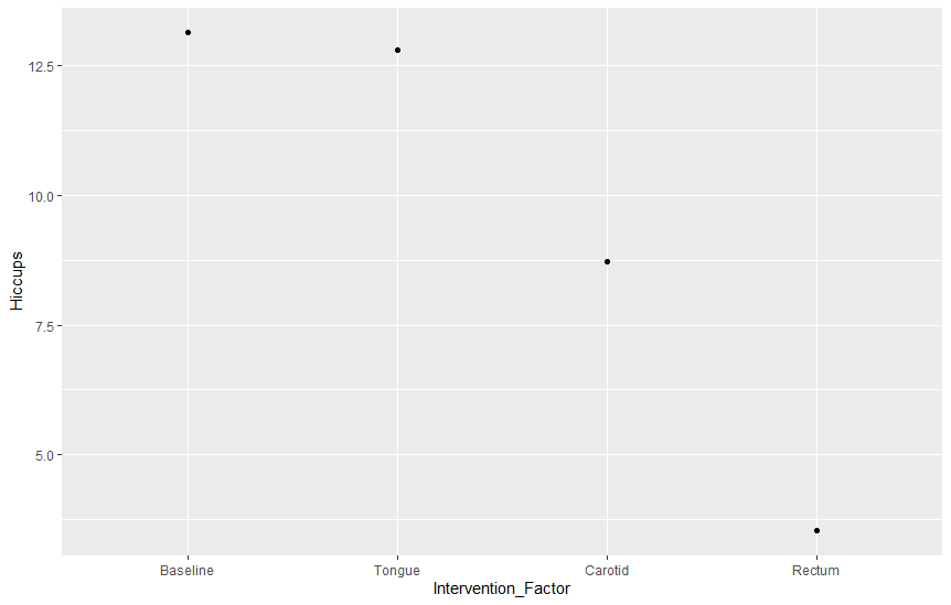
> line + stat_summary(fun.y = mean, geom = 'point') # 1
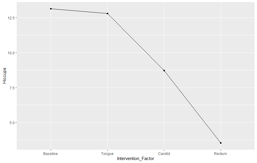
> line + stat_summary(fun.y = mean, geom = 'point') + stat_summary(fun.y = mean, geom = "line", aes(group = 1)) # 2
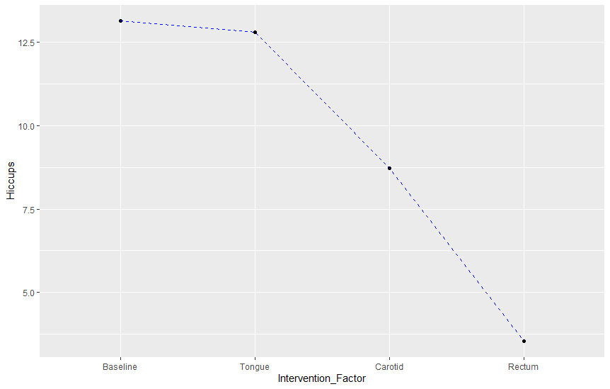
> line + stat_summary(fun.y = mean, geom = 'point') + stat_summary(fun.y = mean, geom = "line", aes(group = 1), colour = 'Blue', linetype = 'dashed') # 3
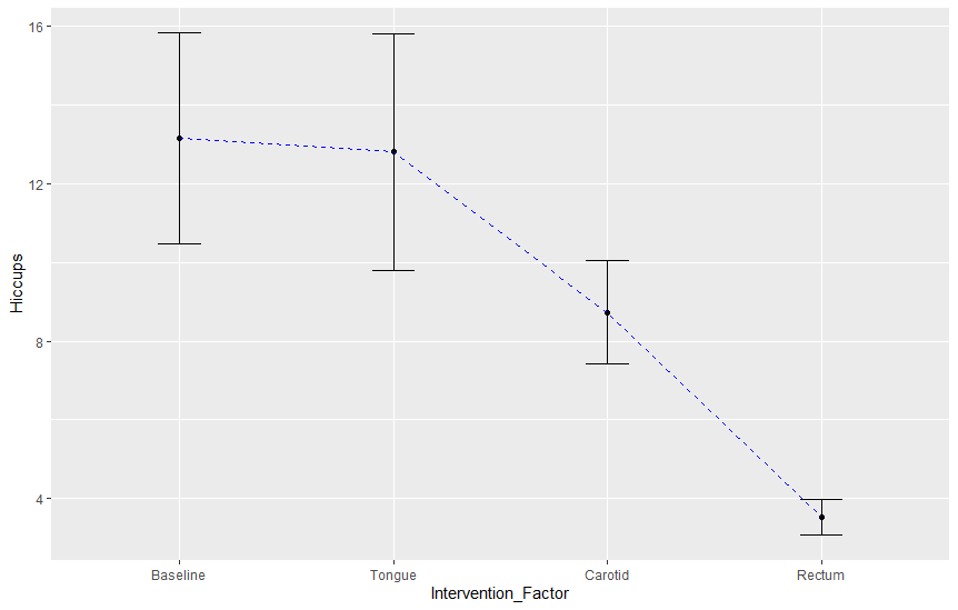
> line + stat_summary(fun.y = mean, geom = 'point') + stat_summary(fun.y = mean, geom = "line", aes(group = 1), colour = 'Blue', linetype = 'dashed') + stat_summary(fun.data = mean_cl_normal, geom = "errorbar", width = 0.2) # 4
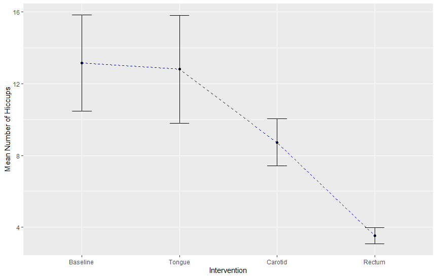
> line + stat_summary(fun.y = mean, geom = 'point') + stat_summary(fun.y = mean, geom = "line", aes(group = 1), colour = 'Blue', linetype = 'dashed') + stat_summary(fun.data = mean_cl_normal, geom = "errorbar", width = 0.2) + labs(x = "Intervention", y = "Mean Number of Hiccups") # 5
Discovering Statistics Using R - 010 [ 2024년12월25일 ]
Discovering Statistics Using R - 009 [ 2024년12월12일 ]
Discovering Statistics Using R - 008 [ 2024년12월10일 ]
Discovering Statistics Using R - 007 [ 2024년12월06일 ]
Discovering Statistics Using R - 006 [ 2024년12월05일 ]
Discovering Statistics Using R - 005 [ 2024년12월04일 ]
Discovering Statistics Using R - 004 [ 2024년12월03일 ]
Discovering Statistics Using R - 003 [ 2024년11월30일 ]